Calming Nursery Color Palette for Perfect Serenity
houseremodelingnews.com may earn a commission if you purchase a product through one of our links
Can the right colors make your baby’s nursery a peaceful place? Starting to create the perfect space for your little one might surprise you. You’ll see how color choices affect your baby’s mood and growth.
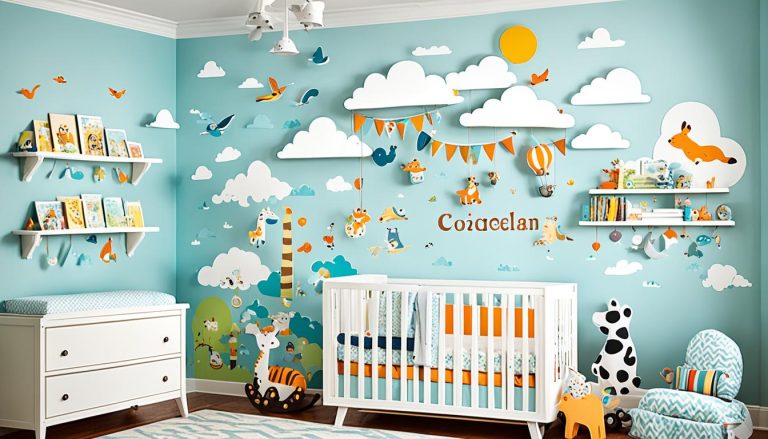
In 2024, nursery colors are getting calmer, with soft blues and gentle neutrals in the lead. These colors remind us of peaceful beaches and clear skies. They’re perfect for making a nursery that helps your baby sleep and relax.
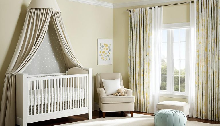
Experts like Christie Kuehner Tonnessen, from Tonnessen Studio, support this trend. Her design features sage green walls with soft beige accents. This mix creates a calm, stylish space that’s great for your baby.
When picking colors for your nursery, think about color psychology. Blue helps your baby feel calm, and soft lavender promotes sleep. These colors can really help your baby sleep better and feel better overall.
Are you looking for the best colors for your baby’s peaceful nursery? Let’s explore soothing colors together. We’ll learn how to make a space that’s both lovely and good for your baby’s growth and comfort.
Understanding Color Psychology in Nursery Design
Color is key in making a nursery calm. Nursery color psychology looks at how colors affect your baby’s mood, growth, and sleep. Let’s dive into calming color psychology and its impact on your little one.
Colors and Baby’s Mood
Babies start noticing colors around five months old. Before that, they mostly see black, grey, and white. By three months, they start to see colors, which helps their brains grow. At five to eight months, they see colors fully, making it great to paint the nursery.
Sleep Patterns and Color
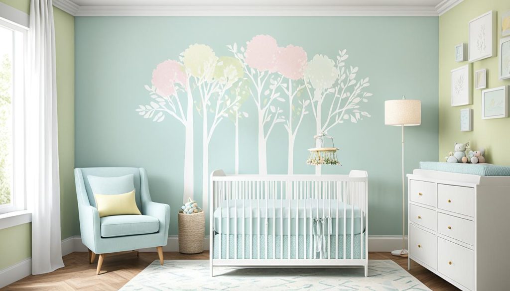
Colors can really change your baby’s sleep. Blue helps lower blood pressure and heart rate, getting the body ready for sleep. It’s great for kids who have trouble sleeping. Green makes a calm space, cutting down on anxiety and helping sleep better.
Balancing Stimulation and Relaxation
For a balanced nursery, mix stimulating and calming colors. Warm colors like red and orange make kids more energetic. But use them carefully to prevent too much stimulation. Soft pastels and neutrals are great for a peaceful feel, ideal for sleep.
“Colors can influence mood and behavior, stimulate the brain and body, and impact health,” says a recent study on color psychology.
Every baby is different. Watch how your child reacts to colors and change your nursery design as needed. With the right colors, you’ll make a soothing space that helps your baby grow and develop.
The Perfect Color Palette for a Calming Nursery
Choosing the right colors for a nursery is key for your baby’s comfort and growth. Soft colors help your baby relax and sleep well. Think about using gentle hues to make the room peaceful.
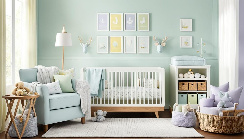
Soft blues and gentle greens are great for a calm nursery. Blue helps with sleep and reduces anxiety. Green boosts focus. Pale purples, like lavender, add a soft touch. White and cream bring a clean and pure feel.
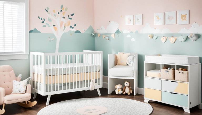
Calming grays paired with white and pastel touches make a thoughtful space. Soft pinks and peach tones show love and care. Earth tones like beige and brown create a cozy feel.
A baby’s color perception develops gradually, with softer shades like blues, greens, and pinks being more soothing and calming.
Keep in mind, babies start seeing colors around 4-5 months old. Use neutral colors on walls and add bold touches with furniture and art. Adding blackout curtains can make the nursery even more peaceful.
Soothing Blue Hues for Tranquil Nursery Spaces
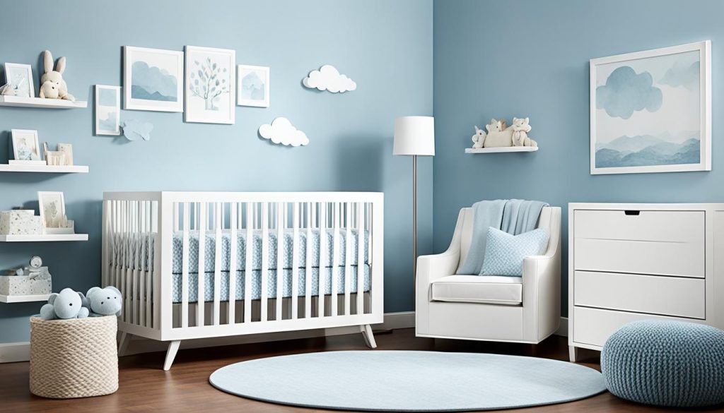
Blue shades are great for calming nursery paint colors. They make your baby’s room peaceful and serene. Light blues like Sweet Bluette 813 are perfect for a calm nursery design.
Powder Blue and Its Calming Effects
Powder blue is a top pick for a quiet nursery. It feels like a clear sky and can slow down your baby’s heart rate. This soft color is great for sleep and quiet play.
Aqua and Turquoise: Bringing Serenity to the Room
Aqua and light turquoise bring nature into your nursery. These colors remind you of the ocean, making the room feel calm and fresh. Pair them with neutral tones like Windswept OC-94 for a balanced look.
Avoiding Dark Blues in Sleep-Centered Spaces
Blue is good for nurseries, but avoid dark shades like Hale Navy HC-154 in sleep areas. They can be too stimulating for babies. Stick to lighter blues for a restful environment that helps your baby’s eyes.
“Soft, soothing colors such as pastel blues are ideal for promoting relaxation and sleep in nurseries.”
The right blue can turn your nursery into a peaceful place. Choose carefully to make the perfect space for your baby to rest and grow.
Nurturing Green Tones for a Natural Ambiance
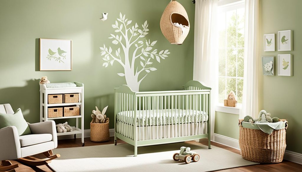
Green tones are great for a baby’s room, making it feel nurturing and natural. This color choice is not just about looks. It also helps your baby grow and stay healthy.
Research shows green is good for health and healing. It can make kids less anxious and help them focus better. Plus, being around green might even make reading easier for them as they get older!
Choose light to medium green shades for your nursery. Earthy colors like sage and moss are great picks. These colors make your nursery feel safe and supportive, helping your baby grow strong.
- Sage green: Offers a soothing, natural feel
- Moss green: Brings the outdoors inside
- Mint green: Adds a fresh, clean touch
If you like darker greens, pair them with lighter colors. This mix keeps the nursery calm but adds depth to the design.
“Green creates a deeply instinctual sense of security, promoting growth and thriving in nurseries.”
Teal is another great option, mixing blue and green. It’s balanced and fits many nursery styles, making it perfect for a baby’s room. The aim is to make a space that calms and supports your baby, while also engaging their senses.
Gentle Purple Shades for Wisdom and Serenity
Purple adds a special mix of wisdom and calm to your nursery. It blends the calming effects of blue with pink’s caring vibe. This creates a perfect space for your little one. Think about using gentle purple shades for a calm nursery feel.
Lavender and Lilac: Creating a Soft Atmosphere
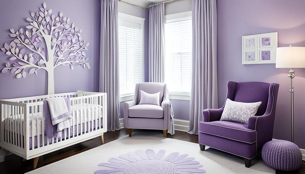
Lavender and lilac are great for a calm nursery. These soft colors make a peaceful space, ideal for your baby’s rest. Paint the walls in these gentle hues to set a soothing base for your nursery.
Choosing Pale Purple Shades
For your nursery, pick lighter purple shades than you might think. Purple can look darker on walls. Lighter tones keep the nursery bright and open.
Balancing Purple with Neutral Colors
To make your nursery peaceful, mix purple with neutral colors. Use lavender or lilac walls with white trim or furniture. Add gray or beige with soft furnishings or decor. This mix makes purple’s calming effect stronger while keeping the look timeless.
“Violet is associated with strength, peace, and wisdom; it promotes inner peace and enhances meditation power under violet light.”
By carefully adding gentle purple shades to your nursery, you make a space that encourages wisdom and calm. This color choice helps create a peaceful place for your baby to grow and flourish.
White and Cream: Innocence and Purity in Nursery Design
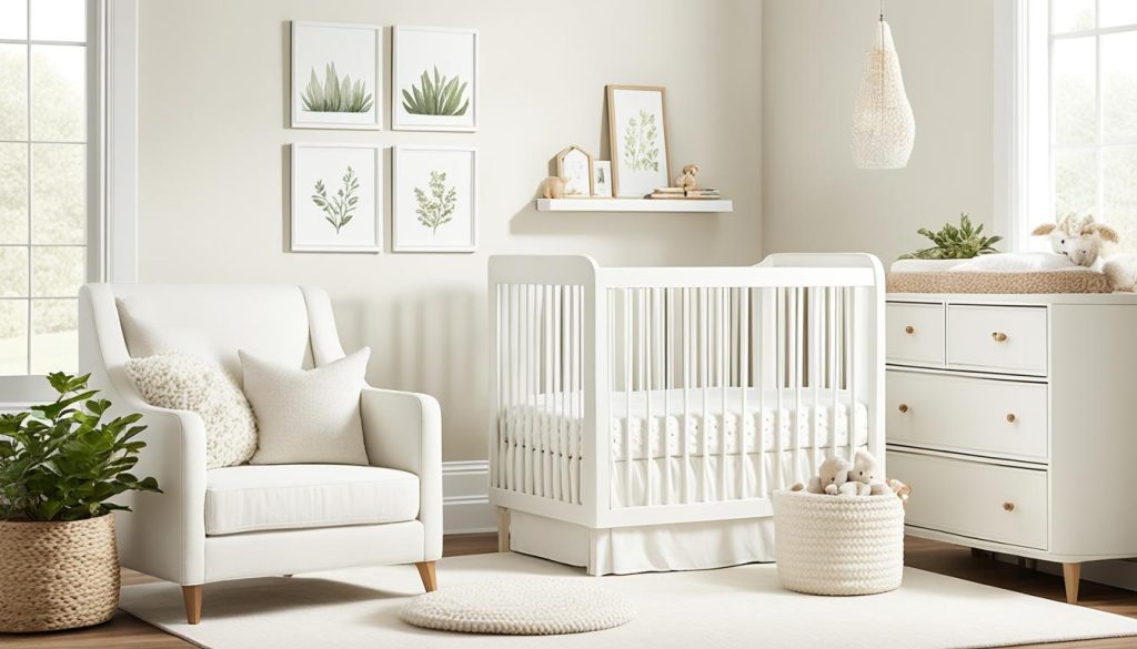
White and cream colors make a nursery feel innocent and pure. They create a calm space perfect for your baby. Soft ivory and antique white give a warm, welcoming feel without the harshness of bright white.
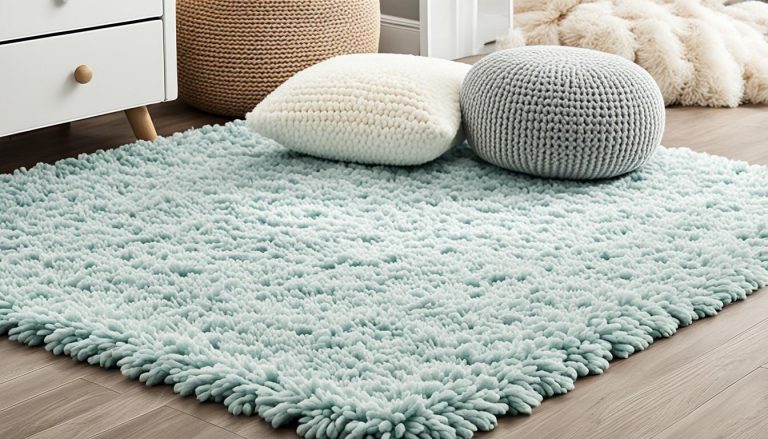
To make the nursery peaceful, add rich textures. Use wicker baskets, wooden furniture, and plush rugs. These add coziness and depth, keeping the room clean and open.
“White is the color of new beginnings, making it ideal for welcoming a new life into your home.”
Add soft, soothing colors for more interest. Pastels like blush pink, seafoam green, or powder blue work well with white. These colors are gentle and won’t overwhelm your baby.
- Use creamy whites for walls and larger pieces
- Add natural textures for warmth
- Incorporate soft pastel accents
- Choose white furniture for a cohesive look
A white nursery is versatile as your child grows. You can change the room’s style with new accessories and colors. This keeps your nursery a peaceful place for years.
Calming Gray Tones for a Contemplative Space
Gray is a great choice for a nursery that’s not just for boys or girls. It helps with thinking and makes the room peaceful. Look for light gray shades to keep the room bright and happy.
Choosing the Right Shade of Gray
Go for soft, blue-gray tones for a calm feel. These colors are perfect for a space where your baby can think and grow. Light grays like Pewter Green SW 6208 add a modern look and highlight the room’s features.
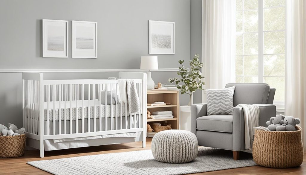
Pairing Gray with White Trim and Pastel Accents
If you pick darker grays, use clean white trim to balance them. Add soft pastel colors to make the room brighter. This mix makes the nursery cozy and peaceful. Think about using lavender or soft rose for accents to help everyone relax.
Incorporating Warm Wood Elements with Gray
Add warm wood pieces to your nursery to balance the gray’s coolness. This mix of textures and colors works well together. Using natural wood furniture or decorations can make the space feel warmer and more inviting.
Gray is a top pick for nurseries because it brings a feeling of luxury and calm. It goes well with many colors, making it a great base for a nursery for any baby. The main goal is to make a space that’s soothing and supports your baby’s growth.
Soft Pink: Unconditional Love and Compassion
Soft pink is a great choice for a nursery. It brings feelings of unconditional love and compassion. This color makes the room warm and cozy for your baby.

Pink has a calming effect on babies. It helps reduce aggressive behavior and encourages relaxation. For a soothing nursery, choose pale, peachy shades or dusty pastels.
Pink walls symbolize love and nurture, wrapping your baby in a gentle embrace.
Use pink in your nursery design with care. Mix it with neutral colors like white, cream, or light gray. This way, the soft pink stands out without taking over the room. Here are some ideas for adding pink:
- Paint an accent wall in soft pink
- Add pink curtains or a plush rug
- Include pink accessories like throw pillows or a cozy blanket
Creating a serene space is key for your baby’s rest and comfort. Soft pink in your nursery design makes a loving space. It supports your baby’s growth and development.
Earth Tones: Grounding and Cozy Nursery Colors
Earth tones make nursery spaces warm and comforting. They create a calm place perfect for your little one. Let’s see how earth tones can make your nursery feel better.
Benefits of Neutral Beige and Brown Shades
Beige and brown shades make a soothing background for your baby’s room. Colors like Benjamin Moore’s Big Bend Beige or Sherwin Williams’ Accessible Beige make it cozy. These warm colors help your child relax and stay calm.
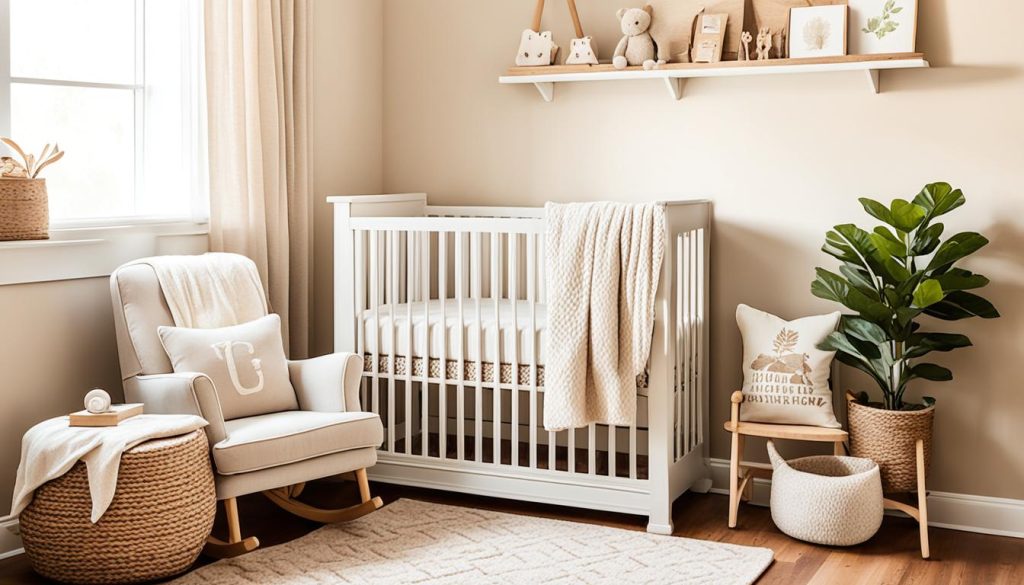
Creating a Restful Environment for Developing Eyes
Soft earth tones are easy on your baby’s eyes. Colors like Benjamin Moore’s Pale Oak or Cream Puff offer a peaceful setting. These shades lessen the visual noise, helping your baby sleep better.
Combining Earth Tones with Other Calming Colors
Earth tones go well with other calming colors. Mixing Farrow & Ball’s Shoji White with soft greens like Benjamin Moore’s Lehigh Green works well. This mix makes a peaceful nursery space that grows with your child.
“Earth tones are ideal for designing soft, layered environments, perfect for creating a serene nursery space.”
Adding earth tones to your nursery design makes a cozy, calming space. It’s great for both you and your baby to relax and feel comfortable.
Gentle Yellow: Bringing Positivity to the Nursery
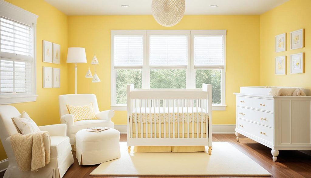
Yellow is a top pick for nursery colors, known for its calming effect. Soft shades like daffodil or dandelion are great choices. They add warmth and positivity without making the room feel too bright.
Adding yellow to your nursery can be easy. You could paint an accent wall or use yellow accessories. A vintage floral wallpaper with yellow can make a lovely backdrop. This way, yellow adds a touch without overwhelming the space.
Colors affect a child’s feelings and growth. Yellow makes a room feel happy and full of energy. It’s a great choice for any baby, helping to create a peaceful nursery.
Yellow is cheerful yet calming, offering a gender-neutral option that brightens up the room while maintaining a soothing atmosphere.
When using yellow in your nursery, balance is important. Mix it with white or gray for a calm space. This mix lets the yellow stand out without making the room too bright. It ensures a peaceful place for your baby to rest and grow.
Teal and Seafoam: Balancing Blue and Green
Teal and seafoam colors mix the calming effects of blue and green. They create a peaceful nursery palette. Teal is versatile and matches many decor styles and themes.
When picking teal or seafoam paint, think about the Light Reflectance Value (LRV). Rainwashed by Sherwin Williams has an LRV of 60. It’s a light blue-green that’s perfect for a calm nursery. Benjamin Moore’s Woodlawn Blue, with an LRV of 61, is a true blue with green. It adds warmth to the room.
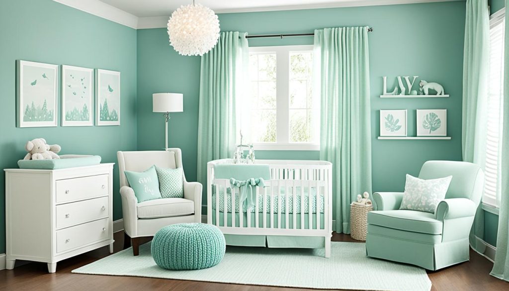
For a nursery that suits both boys and girls, try teal with mustard accents. This adds a modern touch. Or, pair teal with beige or gray for a calmer look. These combos make a room that’s both stylish and soothing for your baby.
Teal and seafoam shades offer comfort and balance. They’re ideal for a peaceful nursery.
Lighting affects how these colors look. Mount Saint Anne by Benjamin Moore has an LRV of 42. It appears as a medium blue-green with gray undertones. This can change with different light in the nursery.
Peachy Tones: A Versatile Alternative to Pink
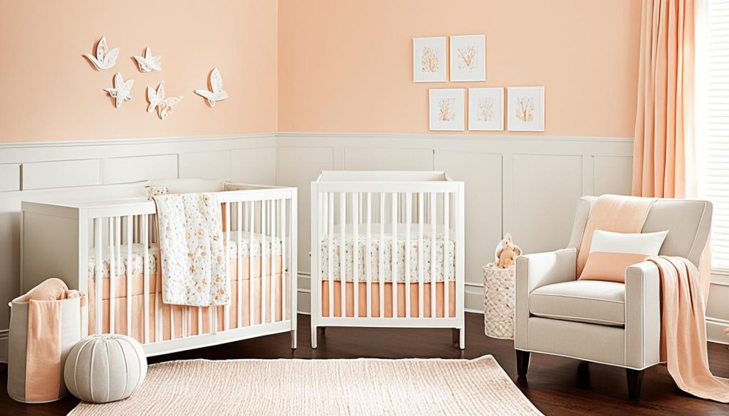
Want a new look for your nursery? Peach is a great choice instead of pink. It brings warmth and makes the space welcoming for your baby.
Creating a serene environment with peach
Peach is a calming color perfect for nurseries. It brightens the room gently, making it soothing. Its light reflectance value is similar to soft pinks, adding to its cozy yet airy feel.
Pairing peach with neutrals and cool tones
Combine peach with neutral shades like white or gray for a balanced look. This mix creates a calm and stylish nursery. Adding cool tones like mint green gives it a fresh, modern vibe.
Using peach as an accent color in nursery design
Not sure about peach walls? Use it as an accent instead. Here are some ideas for using peach in your nursery:
- Paint one wall peach as a focal point
- Use peach-toned accessories like curtains or rugs
- Add peach accents through artwork or wall decals
Choosing the right nursery design is key. Peach is a great choice because it’s soothing and pleasing to look at. It’s a smart pick for your nursery’s color palette.
2024 Nursery Color Trends: Blending Tradition with Modernity
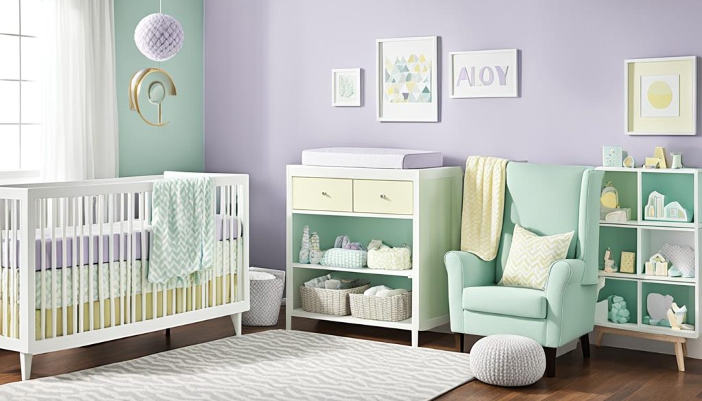
In 2024, nursery colors are mixing old favorites with new styles. Gender-neutral colors are becoming more popular, giving parents many choices. Soft neutrals and calming blues are still top picks, inspired by peaceful ocean views.
Benjamin Moore’s White Dove (OC-17) is a favorite, fitting well with many colors. It makes a peaceful setting for your baby’s room. Edgecomb Gray (HC-173) adds a classic beauty, perfect for the nursery.
Modern ideas for painting nurseries include using bright colors on accent walls. Benjamin Moore’s Raspberry Ice (2072-70) brings fun and energy. Gray Cashmere (2138-60) is a softer choice, adding depth and helping everyone relax.
- Healing Aloe (1562): A soothing greenish-gray promoting tranquility
- Pink Bliss (2093-70): A sophisticated soft pink nurturing joy
- Gray Owl (OC-52): A gentle grey-green blend for an idyllic atmosphere
These trends aim to make nurseries calm and soothing. By mixing old and new, you can create a stylish yet cozy space for your baby.
Tips for Testing and Selecting Nursery Paint Colors
Choosing the perfect nursery color palette is both exciting and challenging. You want to make a space that’s calm and helps your child grow. Here are some tips to help you pick the right nursery paint ideas.
Using Paint Swatches and Samples
Begin by getting paint swatches from a hardware store. These small chips let you see how colors mix. After picking your favorites, buy sample pots to test on the nursery walls.
Paint big squares to see how they look in different lights. This helps you choose the best colors for your nursery.
Lighting Considerations
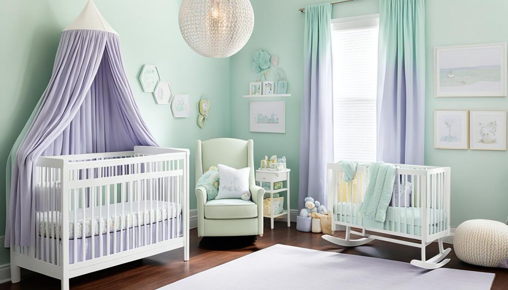
Light can change how paint colors look. Test your colors at different times and with various lights. Colors often seem darker on walls than on swatches, so pick a lighter shade than you think you want.
Coordinating with Furniture and Decor
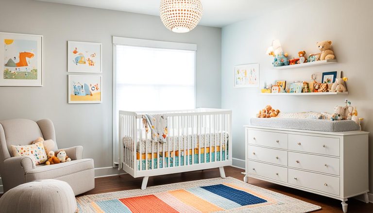
Think about your nursery furniture and decor when picking paint colors. Neutral colors like whites, beiges, and grays work well with most furniture. Choose colors that match your crib, changing table, and other key items for a unified look.
“Colors have the power to create emotions and set the mood in a room. Choose wisely for your little one’s sanctuary.”
Follow these tips to make a calm and lovely nursery. Both you and your baby will love it.
Closing Thoughts
Starting your journey to make a calming nursery design? Remember, color is key. The right colors can turn a room into a peaceful space for your baby. Experts say soothing blue shades are popular for 2024, showing how calming colors are in trend.
Think about using neutral colors like cream, beige, and soft yellows as your base. These colors are calming. You can add personality with gentle blue, pink, or lilac accents. Using lighter and darker shades of the same color can also add energy while keeping things calm.
Before you decide, test your colors in different lights. You can get inspiration from bedding or accessories. Child Craft offers cribs in many colors and finishes, making it easy to find the right look for your nursery. Choosing the right colors makes a peaceful nursery that you and your baby will love.

